sdvplotR ships with a function that makes creating tier
lists convenient and quick. However, you need to pass your data to
gt in a specific format. This vignette walks through how to
create a simple tier list.
Basic Tier List
For this example, we rank the ACC’s men’s basketball teams by
efficiency margin: points scored minus points allowed per 100
possessions, over the last completed season, computed from hoopR’s ESPN
box scores.
Processing
team_reference() lists the ACC’s members, with their
ESPN ids and logos. The box scores hold one row per team per game;
joining each row to its opponent’s row gives the possessions and points
on both sides.
# the last completed season, tournament included (hoopR names it for the
# year it ends; the Final Four is in early April)
season <- as.integer(format(Sys.Date(), "%Y")) -
  (format(Sys.Date(), "%m-%d") < "04-10")

acc <- team_reference("mbb") %>%
  filter(conference == "ACC")

# possessions estimated from the box score
box <- hoopR::load_mbb_team_box(seasons = season) %>%
  mutate(poss = field_goals_attempted - offensive_rebounds + total_turnovers + 0.475 * free_throws_attempted)

data <- box %>%
  filter(team_id %in% acc$espn_team_id) %>%
  inner_join(
    select(box, game_id, opponent_team_id = team_id, opp_poss = poss),
    by = c("game_id", "opponent_team_id")
  ) %>%
  summarise(
    eff_margin = 100 * sum(team_score - opponent_team_score) / sum((poss + opp_poss) / 2),
    .by = team_id
  ) %>%
  mutate(team = acc$team_abbr[match(team_id, acc$espn_team_id)])
We need to establish tiers and colors. For this example, we are going to use three distinct categories and use traditional tier list background colors.
Next, we need to bin our data into these tiers.
subset_rank uses the dense_rank function to
assign ordinal ranks based on our column of interest – efficiency
margin. Next, we use the cut function to divide these ranks into
distinct tiers based on quantiles, specifying the breaks at the 25th and
75th percentiles. This means the data is split into three groups, with
the lower 25% in one tier, the middle 50% in another, and the upper 25%
in the final tier. The levels argument provides custom labels for each
tier – referencing the levels vector above – while
include.lowest = TRUE ensures the lowest rank is included
in the first tier.
Finally, tier_order is calculated as the rank within each tier using
dense_rank again, but this time grouped by the tier to
ensure the ordering is relative to each group.
data <- data %>%
  mutate(
    subset_rank = dense_rank(-eff_margin),
    tier = cut(subset_rank,
      breaks = quantile(subset_rank, probs = c(0, 0.25, 0.75, 1)),
      labels = levels,
      include.lowest = TRUE
    )
  ) %>%
  mutate(tier_order = dense_rank(subset_rank), .by = tier)
team_reference() also carries each team’s logos. We are
going to use a dark table theme, so we take the dark-mode logo, falling
back to the primary one where ESPN has no dark version.
data <- data %>%
  left_join(select(acc, team = team_abbr, logo_dark_url, logo_url), by = "team") %>%
  mutate(logo = coalesce(logo_dark_url, logo_url))
Finally, we need to pivot our data to a wide format. This ensures that we will be plotting logos horizontally.
data <- data %>%
  pivot_wider(id_cols = tier, names_from = tier_order, values_from = logo) %>%
  select(tier, sort(names(.))) %>%
  arrange(tier)
Great – if your data looks similar to this, you’re ready to make a tier list!
Plotting
gt_tiers does a few things under the hood: - It renders
images from links - It applies the gt_theme_tier function
using “dark” mode as a default - It forces all column labels to be
blank
Let’s apply it!
data %>%
  gt() %>%
  gt_tiers(levels, colors) %>%
  tab_header(
    title = "Example Tier List using gtUtils",
    subtitle = paste("Ranking ACC teams by efficiency margin,", season)
  )
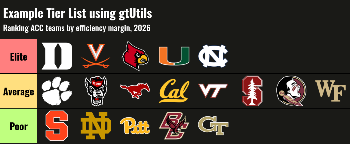
All done! You’ve created a tier list in gt using
sdvplotR. The tier list function is somewhat limited: a) it
only supports image cells and b) it will not “wrap” your logos to
condense the width (you can play around with image_height to do
this).