Interactive NFL EPA Scatter
Saiem Gilani


Source: vignettes/recipe-nfl-epa-interactive.Rmd
recipe-nfl-epa-interactive.RmdOn this page
The brief: the team’s website wants the season’s
offense-vs-defense chart as something readers can explore: point at any
logo and see the team’s EPA per play on both sides of the ball and where
that ranks. It is the interactive version of the NFL EPA Scatter recipe, with the
same data and the same flipped defense axis. ggiraph’s
girafe() turns the ggplot into an interactive SVG, and
geom_sdv_logos_interactive() gives each logo a hover
target.
library(sdvplotR)
library(ggplot2)
library(dplyr, warn.conflicts = FALSE)
library(ggiraph)

season <- 2025
1. Get the data
The same table as the static recipe: one season of play-by-play, cut
to regular-season runs and passes with an EPA value, averaged by the
team with the ball and by the team on defense, then ranked. A tooltip
should name the team, so the full name comes from
sdv_teams(), joined on the team id that
sdv_resolve() finds for each nflverse abbreviation.
plays <- nflreadr::load_pbp(season) |>
  filter(season_type == "REG", play_type %in% c("pass", "run"), !is.na(epa))

offense <- plays |>
  group_by(team = posteam) |>
  summarise(off_epa = mean(epa), plays = n())
defense <- plays |>
  group_by(team = defteam) |>
  summarise(def_epa = mean(epa))
stopifnot(is.character(offense$team), is.character(defense$team)) # one type on both sides of the key

team_names <- sdv_teams("nfl") |> select(team_id, name)
teams <- inner_join(offense, defense, by = "team") |>
  mutate(
    off_rank = min_rank(desc(off_epa)),
    def_rank = min_rank(def_epa), # less EPA allowed is better
    team_id = sdv_resolve(team, league = "nfl")
  ) |>
  inner_join(team_names, by = "team_id")
stopifnot(nrow(teams) == 32)
head(teams)
#> # A tibble: 6 × 8
#>   team  off_epa plays  def_epa off_rank def_rank team_id name
#>   <chr>   <dbl> <int>    <dbl>    <int>    <int> <chr>   <chr>
#> 1 ARI   -0.0185  1074  0.0884        23       27 22      Arizona Cardinals
#> 2 ATL   -0.0214  1036 -0.00374       24       15 1       Atlanta Falcons
#> 3 BAL    0.0340   956  0.0251        12       21 33      Baltimore Ravens
#> 4 BUF    0.136   1065 -0.0163         3       13 2       Buffalo Bills
#> 5 CAR   -0.0393   996  0.0673        26       23 29      Carolina Panthers
#> 6 CHI    0.0795  1096  0.0181         8       19 3       Chicago Bears
The page embeds this table, not the play-by-play: 32 rows, one per logo.
2. Logos with hover details
geom_sdv_logos_interactive() is
geom_sdv_logos() plus an invisible point over each logo
that takes the hover. tooltip and data_id go
in the same aes() as team. The tooltip is
HTML, so <br> breaks the lines and
<b> sets the name in bold. The quadrant layers are
the static recipe’s: the league-average lines, a label in each corner,
and scale_y_reverse() so the best defenses are on top.
corners <- data.frame(
  x = c(Inf, -Inf, Inf, -Inf),
  y = c(-Inf, -Inf, Inf, Inf), # reversed scale: -Inf is the top
  label = c(
    "Good offense, good defense", "Bad offense, good defense",
    "Good offense, bad defense", "Bad offense, bad defense"
  ),
  hjust = c(1.02, -0.02, 1.02, -0.02),
  vjust = c(1.5, 1.5, -0.6, -0.6)
)

quadrants <- list(
  geom_mean_lines(aes(x0 = off_epa, y0 = def_epa), color = "grey60", linewidth = 0.4),
  geom_text(
    aes(x, y, label = label, hjust = hjust, vjust = vjust),
    data = corners, inherit.aes = FALSE,
    size = 3, color = "grey55", fontface = "italic"
  ),
  scale_x_continuous(expand = expansion(mult = 0.07)),
  scale_y_reverse(expand = expansion(mult = 0.12))
)

teams <- teams |>
  mutate(tip = sprintf(
    "<b>%s</b><br>Offense: %+.3f EPA per play (No. %d)<br>Defense: %+.3f EPA per play allowed (No. %d)",
    name, off_epa, off_rank, def_epa, def_rank
  ))
The chart is the static recipe’s with one layer swapped:
geom_sdv_logos_interactive() in place of
geom_sdv_logos(). data_id names each hover
target; the next step uses it to tell the hovered team from the other
31. hover_size makes each target about as wide as its
logo.
p_epa <- ggplot(teams, aes(off_epa, def_epa)) +
  quadrants +
  geom_sdv_logos_interactive(
    aes(team = team, tooltip = tip, data_id = team),
    league = "nfl", width = 0.055, hover_size = 14
  ) +
  labs(
    title = paste("NFL offense vs defense,", season, "regular season"),
    subtitle = "EPA per play on runs and passes. Defense axis flipped: up and right is better.",
    x = "Offense EPA per play", y = "Defense EPA per play allowed",
    caption = "Data: nflverse via nflreadr  |  Chart: sdvplotR"
  ) +
  theme_minimal(base_size = 10) +
  theme(
    plot.title.position = "plot",
    plot.title = element_text(face = "bold", size = 13),
    plot.subtitle = element_text(color = "grey40", size = 9),
    plot.caption = element_text(color = "grey45", size = 7.5),
    panel.grid.minor = element_blank()
  )
3. Hover one team to fade the rest
girafe() draws the ggplot as an interactive SVG, and its
options style the hover. opts_tooltip() gives
the tooltip a white card. ggiraph styles the element under the pointer
with opts_hover() and every other element with a
data_id with opts_hover_inv(). A logo is an
image, which that CSS cannot fade, so the fade is done by the hover
targets: opts_hover_inv() paints the other 31 targets white
at 75% opacity, a veil over each logo, and opts_hover()
keeps the hovered team’s target clear.
epa_widget <- girafe(
  ggobj = p_epa, width_svg = 7, height_svg = 4.4,
  options = list(
    opts_tooltip(css = "background:white;color:#222;padding:6px 8px;border-radius:6px;box-shadow:0 1px 4px rgba(0,0,0,0.3);font-size:12px;"),
    opts_hover(css = "fill:none;stroke:none;"),
    opts_hover_inv(css = "fill:white;fill-opacity:0.75;stroke:none;"),
    opts_toolbar(saveaspng = FALSE)
  )
)
epa_widget
Point at a logo in the middle of the pack, where the static chart’s logos overlap: the tooltip names the team and the other logos fade, so no logo has to be found by eye. The veil sits on top of the logos because the hover targets are the layer drawn after them; a team half under a neighbor keeps a faint edge of the neighbor’s veil.
The SVG embeds a copy of each logo, at most 160 px a side (the
max_px argument), so the 32 logos add about half a megabyte
to the page. For a page of several charts, the cookbook’s headshot-in-tooltip
recipe loads images by link instead.
4. Share it
htmlwidgets::saveWidget() writes the chart to one HTML
file. selfcontained = TRUE inlines ggiraph’s JavaScript,
and the 32 logos already travel inside the SVG, so the file opens
anywhere with no folder beside it and no network (it needs pandoc, which
ships with RStudio).
out <- tempfile("sdvplotR-recipe-")
dir.create(out)
html <- file.path(out, "nfl_epa_interactive.html")
htmlwidgets::saveWidget(epa_widget, html, selfcontained = TRUE, title = "NFL offense vs defense")
round(file.size(html) / 1024) # kilobytes
#> [1] 9046
5. The static version
girafe() draws a ggplot, so the same object prints as a
static chart, for a post or a slide: the interactive layers draw as
their plain counterparts. ggsave() exports it as in the
static recipe.
p_epa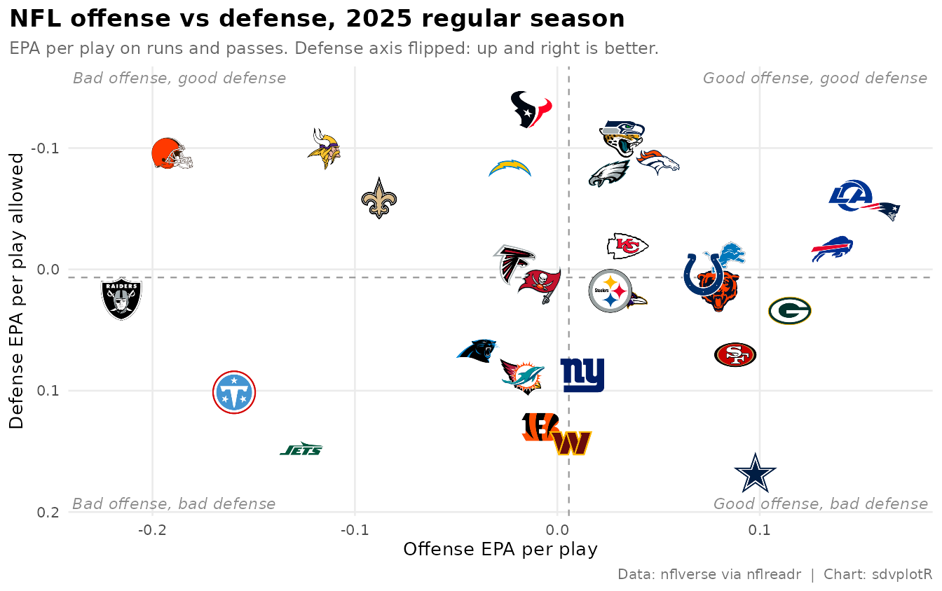
Related
- NFL EPA Scatter: the static recipe, with the Super Bowl callouts and the social exports.
- Interactive charts: ggiraph, plotly, leaflet and reactable with sdvplotR.
- Reference: geom_sdv_logos_interactive(), geom_sdv_logos(), geom_mean_lines(), sdv_resolve(), sdv_teams().






Related SportsDataverse packages
- sdvplot - the Python plotting package
- sdvplot-js - the JavaScript / TypeScript plotting packages
- cfbfastR - college football
- hoopR - men’s basketball
- wehoop - women’s basketball
- baseballr - baseball
- fastRhockey - hockey
- oddsapiR - betting odds
- sportyR - playing surfaces
- sportsdataverse-py - the Python package
- sportsdataverse-R - the R meta-package