

On this page
Twelve recipes for team logos and headshots on charts you can hover, zoom and share: ggiraph makes a ggplot interactive and keeps every sdvplotR layer, plotly draws logos as layout images, and reactable makes a sortable table; leaflet puts logos on a map. The last two recipes save a chart as one HTML file and as a PNG for a social post. The data is one season each from MLB (baseballr, from the MLB Stats API), the NBA, the WNBA and the NHL (hoopR, wehoop and fastRhockey), and the NFL and college football (nflreadr and cfbfastR), all but MLB read from SportsDataverse release files.
library(sdvplotR)
library(ggplot2)
library(dplyr, warn.conflicts = FALSE)
library(ggiraph)
library(plotly, warn.conflicts = FALSE)

season <- 2026 # MLB and WNBA: 2026; NBA and NHL: the 2025-26 season
1. ggiraph: logos with hover details
ggiraph’s girafe() turns a ggplot into an interactive
SVG, and every sdvplotR layer comes along: logos are embedded in the
SVG. Logos themselves don’t respond to the pointer, so put the tooltip
on a nearly transparent geom_point_interactive() at the
same spot. MLB’s 2026 season, runs scored and allowed per game:
mlb_ids <- baseballr::mlb_teams(season = season, sport_ids = 1) |>
  as.data.frame() |>
  select(team_records_team_id = team_id, team_abbreviation, team_full_name)
mlb <- baseballr::mlb_standings(season = season, league_id = "103,104") |>
  as.data.frame() |>
  inner_join(mlb_ids, by = "team_records_team_id") |>
  transmute(
    team = sdv_resolve(team_abbreviation, league = "mlb"),
    name = team_full_name,
    wins = team_records_wins,
    losses = team_records_losses,
    rs = team_records_runs_scored / team_records_games_played,
    ra = team_records_runs_allowed / team_records_games_played,
    run_diff = team_records_runs_scored - team_records_runs_allowed
  ) |>
  arrange(team)
nrow(mlb)
#> [1] 30
p_mlb <- ggplot(mlb, aes(x = rs, y = ra)) +
  geom_abline(slope = 1, intercept = 0, colour = "grey60", linetype = "dashed") +
  geom_sdv_logos(aes(team = team), league = "mlb", width = 0.06) +
  geom_point_interactive(
    aes(tooltip = sprintf("%s<br>%d-%d<br>%.2f scored, %.2f allowed per game", name, wins, losses, rs, ra),
        data_id = team),
    size = 9, alpha = 0.01
  ) +
  scale_x_continuous(expand = expansion(mult = 0.08)) +
  scale_y_continuous(expand = expansion(mult = 0.08)) +
  labs(
    title = "MLB runs scored and allowed, 2026",
    subtitle = "Per game; teams below the dashed line outscored their opponents",
    x = "Runs scored per game", y = "Runs allowed per game",
    caption = "Data: baseballr::mlb_standings() (MLB Stats API)"
  ) +
  theme_minimal()

girafe(ggobj = p_mlb, width_svg = 7, height_svg = 5)
alpha = 0.01, not 0: a fully transparent point is
dropped from the SVG and catches nothing.
2. ggiraph: a tooltip with a picture
A tooltip is HTML, so it can carry an image. hoopR’s player box score
has each player’s ESPN headshot URL
(athlete_headshot_href); the browser loads it on hover, so
the page stays light. The 2025-26 season’s 25 top scorers (50+ games),
each point in his team’s color:
# the regular season without the All-Star games and the NBA Cup final
nba_regular <- hoopR::load_nba_schedule(season) |>
  as.data.frame() |>
  filter(season_type == 2, type_abbreviation == "STD") |>
  pull(game_id)
players <- hoopR::load_nba_player_box(season) |>
  as.data.frame() |>
  filter(game_id %in% nba_regular, !did_not_play)

scorers <- players |>
  summarise(
    games = n(),
    ppg = mean(points),
    ts = sum(points) / (2 * (sum(field_goals_attempted) + 0.44 * sum(free_throws_attempted))),
    team = last(team_abbreviation, order_by = game_date),
    headshot = last(athlete_headshot_href, order_by = game_date),
    .by = c(athlete_id, athlete_display_name)
  ) |>
  filter(games >= 50) |>
  arrange(desc(ppg), athlete_id) |>
  slice_head(n = 25) |>
  mutate(tip = sprintf(
    "<img src='%s' height='80'><br><b>%s</b> (%s)<br>%.1f points, %.1f%% true shooting",
    headshot, athlete_display_name, team, ppg, 100 * ts
  ))

p_scorers <- ggplot(scorers, aes(x = ppg, y = ts)) +
  geom_point_interactive(aes(fill = team, tooltip = tip, data_id = athlete_id),
    shape = 21, size = 4, colour = "white", stroke = 0.6
  ) +
  scale_fill_sdv(league = "nba") +
  scale_y_continuous(labels = scales::label_percent(accuracy = 1)) +
  labs(
    title = "The NBA's 25 top scorers, 2025-26",
    subtitle = "Hover a point for the player",
    x = "Points per game", y = "True shooting %",
    caption = "Data: hoopR::load_nba_player_box(); headshots: ESPN"
  ) +
  theme_minimal()

girafe(
  ggobj = p_scorers, width_svg = 7, height_svg = 4.5,
  options = list(opts_tooltip(css = "background:white;color:black;padding:6px;border-radius:6px;"))
)
A player traded mid-season shows his latest team here, the one in his last game.
3. ggiraph: hover one line to pick it out
With fifteen teams, a line chart is a tangle. Give each line a
data_id and ggiraph highlights the one under the pointer;
opts_hover_inv() fades the rest. The WNBA’s 2026 regular
season as cumulative wins:
# standard games only: no All-Star Game or Commissioner's Cup final
wnba_regular <- wehoop::load_wnba_schedule(season) |>
  as.data.frame() |>
  filter(season_type == 2, type_abbreviation == "STD") |>
  pull(game_id)
wnba_runs <- wehoop::load_wnba_team_box(season) |>
  as.data.frame() |>
  filter(game_id %in% wnba_regular) |>
  arrange(team_abbreviation, game_date, game_id) |>
  mutate(game_no = row_number(), wins = cumsum(team_winner), .by = team_abbreviation) |>
  rename(team = team_abbreviation)

p_wnba <- ggplot(wnba_runs, aes(x = game_no, y = wins, colour = team)) +
  geom_line_interactive(aes(data_id = team, tooltip = team_display_name), linewidth = 1) +
  scale_colour_sdv(league = "wnba") +
  labs(
    title = "The WNBA's 2026 season, win by win",
    subtitle = "Hover a line to pick out a team",
    x = "Game", y = "Wins",
    caption = "Data: wehoop::load_wnba_team_box()"
  ) +
  theme_minimal()

girafe(
  ggobj = p_wnba, width_svg = 7, height_svg = 4.5,
  options = list(
    opts_hover(css = "stroke-width:3;"),
    opts_hover_inv(css = "opacity:0.15;")
  )
)
opts_selection() keeps a line highlighted on click, for
comparing two teams.
4. ggiraph: interactive bars with logos on the axis
Axis logos from scale_x_sdv() and
theme_x_sdv() work in ggiraph too, since the SVG embeds the
images. The bars carry the tooltip. NBA three-point volume, 2025-26:
threes <- hoopR::load_nba_team_box(season) |>
  as.data.frame() |>
  filter(game_id %in% nba_regular) |>
  summarise(
    games = n(),
    tpa = mean(three_point_field_goals_attempted),
    tp_pct = sum(three_point_field_goals_made) / sum(three_point_field_goals_attempted),
    .by = team_abbreviation
  ) |>
  arrange(desc(tpa), team_abbreviation) |>
  mutate(team = factor(team_abbreviation, levels = team_abbreviation))

p_threes <- ggplot(threes, aes(x = team, y = tpa)) +
  geom_col_interactive(
    aes(fill = team_abbreviation, data_id = team_abbreviation,
        tooltip = sprintf("%s: %.1f attempts, %.1f%% made", team_abbreviation, tpa, 100 * tp_pct)),
    width = 0.75
  ) +
  scale_x_sdv(league = "nba", size = 16) +
  scale_fill_sdv(league = "nba") +
  scale_y_continuous(expand = expansion(mult = c(0, 0.05))) +
  labs(
    title = "NBA three-point attempts per game, 2025-26",
    x = NULL, y = "3PA per game",
    caption = "Data: hoopR::load_nba_team_box()"
  ) +
  theme_minimal() +
  theme_x_sdv() +
  theme(panel.grid.major.x = element_blank())

girafe(ggobj = p_threes, width_svg = 8, height_svg = 4.5)
Every logo is embedded in the page, as a small copy sized for the axis label, so thirty of them add about 100 KB; recipe 2’s URL-in-tooltip approach adds nothing.
5. plotly: ggplotly() drops the logos, so add them
back
ggplotly() converts most layers, but not sdvplotR’s
image geoms: it warns and leaves them out. Draw the logos as plotly
layout images instead, one per team, positioned in data units. A small
helper builds them from sdv_logo_url(). The NFL’s 2025
offenses and defenses:
logo_images <- function(teams, x, y, sport, sizex, sizey = sizex, xref = "x", yref = "y") {
  urls <- sdv_logo_url(teams, league = sport)
  lapply(seq_along(urls), function(i) {
    list(
      source = urls[i], xref = xref, yref = yref, x = x[i], y = y[i],
      sizex = sizex, sizey = sizey, xanchor = "center", yanchor = "middle", layer = "above"
    )
  })
}
nfl_weeks <- nflreadr::load_team_stats(2025, summary_level = "week") |>
  as.data.frame() |>
  filter(season_type == "REG") |>
  mutate(plays = attempts + sacks_suffered + carries, epa = passing_epa + rushing_epa)
nfl <- inner_join(
  summarise(nfl_weeks, off_epa = sum(epa) / sum(plays), .by = team),
  nfl_weeks |>
    mutate(team = opponent_team) |>
    summarise(def_epa = sum(epa) / sum(plays), .by = team),
  by = "team"
) |>
  arrange(team)

p_nfl <- ggplot(nfl, aes(x = off_epa, y = def_epa)) +
  geom_point(aes(text = sprintf("%s<br>offense %+.3f<br>defense %+.3f", team, off_epa, def_epa)),
    alpha = 0
  ) +
  labs(
    title = "NFL offense vs defense, 2025",
    x = "Offense: EPA per play", y = "Defense: EPA per play allowed"
  ) +
  theme_minimal()

ggplotly(p_nfl, tooltip = "text") |>
  layout(
    images = logo_images(nfl$team, nfl$off_epa, nfl$def_epa, "nfl",
      sizex = 0.025, sizey = 0.025
    ),
    yaxis = list(autorange = "reversed") # good defense at the top
  )
text is an aesthetic only ggplotly reads, so ggplot2
warns that it is unknown (the chunk hides that warning).
sizex and sizey are in axis units, and the
image keeps its shape inside that box; here both axes run in EPA, so one
size fits. Reverse an axis in layout() rather than with
scale_y_reverse(), which ggplotly turns into negative
values.
6. plotly: logos as markers, built natively
Without ggplot2, plot_ly() draws a transparent marker
trace that carries the hover text, and the logos go on as layout images.
Set the axis ranges yourself and give the logos a margin, since plotly
sizes its autorange from the markers only. NHL goals for and against per
game, 2025-26:
nhl <- fastRhockey::load_nhl_team_box(season) |>
  as.data.frame() |>
  filter(substr(game_id, 5, 6) == "02") |>
  mutate(team = sdv_resolve(team_abbrev, league = "nhl")) |>
  summarise(games = n(), gf = mean(goals), ga = mean(goals_against), .by = team) |>
  arrange(team)

pad <- 0.15
plot_ly(
  nhl, x = ~gf, y = ~ga, type = "scatter", mode = "markers",
  marker = list(size = 28, opacity = 0),
  text = ~sprintf("%s: %.2f for, %.2f against", team, gf, ga), hoverinfo = "text"
) |>
  layout(
    title = list(text = "NHL goals per game, 2025-26 regular season", x = 0.02),
    xaxis = list(title = "Goals for per game", range = range(nhl$gf) + c(-pad, pad)),
    yaxis = list(title = "Goals against per game", range = rev(range(nhl$ga) + c(-pad, pad))),
    images = logo_images(nhl$team, nhl$gf, nhl$ga, "nhl", sizex = 0.12, sizey = 0.12)
  )
A range given high-to-low reverses the axis, here so
good defense is at the top.
add_sdv_logos() does the same placement for you, in data
units, so there is no helper to write. It takes the positions and the
teams, and its size is the logo height as a share of the
y-axis span:
plot_ly(
  nhl, x = ~gf, y = ~ga, type = "scatter", mode = "markers",
  marker = list(size = 28, opacity = 0),
  text = ~sprintf("%s: %.2f for, %.2f against", team, gf, ga), hoverinfo = "text"
) |>
  layout(
    xaxis = list(title = "Goals for per game", range = range(nhl$gf) + c(-pad, pad)),
    yaxis = list(title = "Goals against per game", range = rev(range(nhl$ga) + c(-pad, pad)))
  ) |>
  add_sdv_logos(nhl$gf, nhl$ga, nhl$team, "nhl", size = 0.08)
ggplotly() is the wrong tool for this because it drops
layout images, so build the chart with plot_ly() and add
the marks with these helpers.
7. plotly: logos on a category axis
Put each logo under its bar by giving the image
yref = "paper" (0 is the bottom of the plot area) and
yanchor = "top", then hide the tick labels and grow the
bottom margin to make room. On a category axis, bars sit at positions 0,
1, 2, and so on. MLB’s 2026 run differential:
mlb_diff <- mlb |>
  arrange(desc(run_diff), team) |>
  mutate(fill = unname(sdv_team_colors("mlb", team)))

plot_ly(
  mlb_diff, x = ~factor(team, levels = team), y = ~run_diff, type = "bar",
  marker = list(color = ~fill),
  text = ~sprintf("%s: %+d runs", name, run_diff), hoverinfo = "text", textposition = "none"
) |>
  layout(
    title = list(text = "MLB run differential, 2026 regular season", x = 0.02),
    xaxis = list(title = "", showticklabels = FALSE),
    yaxis = list(title = "Run differential"),
    images = logo_images(mlb_diff$team, seq_len(nrow(mlb_diff)) - 1, rep(0, nrow(mlb_diff)), "mlb",
      sizex = 0.9, sizey = 0.08, yref = "paper"
    ) |> lapply(modifyList, list(yanchor = "top")),
    margin = list(b = 50, t = 50)
  )
sizey is now a share of the plot’s height (paper units),
and sizex a share of one category’s slot.
sdv_axis_logos() does all of that in one call, hiding
the tick labels and placing a logo under each category:
8. reactable: a sortable, searchable table
For a table rather than a chart, reactable sorts, searches and pages
in the browser, and sdvplotR supplies the cell renderers:
reactable_sdv_logos() for a logo column and
reactable_sdv_team_color_bar() for a bar in each row’s team
color. The SEC’s 2025 football season from ESPN’s schedule file:
sec <- sdv_teams("cfb") |>
  filter(conference_id == "cfb:sec") |>
  select(team = abbr, school = location)

games <- cfbfastR::load_espn_cfb_schedules(2025) |> as.data.frame()
sec_table <- bind_rows(
  transmute(games, team = home_abbreviation, pf = home_score, pa = away_score),
  transmute(games, team = away_abbreviation, pf = away_score, pa = home_score)
) |>
  inner_join(sec, by = "team") |>
  summarise(
    W = sum(pf > pa), L = sum(pf < pa),
    PF = round(mean(pf), 1), PA = round(mean(pa), 1), Margin = round(mean(pf - pa), 1),
    .by = c(team, school)
  ) |>
  arrange(desc(Margin), team)

reactable::reactable(
  sec_table,
  searchable = TRUE, defaultPageSize = 8, highlight = TRUE, compact = TRUE,
  columns = list(
    team = reactable::colDef(name = "", cell = reactable_sdv_logos("cfb", height = 26), html = TRUE, width = 50),
    school = reactable::colDef(name = "School", minWidth = 120),
    Margin = reactable::colDef(
      style = reactable_sdv_team_color_bg(sec_table, "team", "cfb", alpha = 0.25)
    )
  )
)
The reactable integration article covers the other renderers: headshots, logo column headers and team-colored rows.
9. ggiraph: one call for the images and the hover
geom_sdv_logos_interactive() is
geom_sdv_logos() plus the hover layer of recipe 1, so
tooltip and data_id go in the same
aes() as team. The wordmark and headshot geoms
have _interactive() versions too. A small hand-made table
of NFL teams:
demo <- data.frame(x = 1:3, y = c(2, 3, 1), team = c("KC", "BUF", "BAL"))
p_demo <- ggplot(demo, aes(x, y)) +
  geom_sdv_logos_interactive(
    aes(team = team, tooltip = team, data_id = team),
    league = "nfl", width = 0.15
  ) +
  xlim(0.5, 3.5) + ylim(0.5, 3.5) +
  theme_minimal()
girafe(ggobj = p_demo, width_svg = 5, height_svg = 4)
10. leaflet: logos as map markers
addSdvLogoMarkers() puts a team’s logo on each marker;
lng, lat and team take formulas
that read the map’s data. A team without a logo keeps leaflet’s default
marker, with a warning, so no point goes missing.
stadiums <- data.frame(
  team = c("KC", "BUF", "GB"),
  lon = c(-94.48, -78.79, -88.06),
  lat = c(39.05, 42.77, 44.50)
)
leaflet::leaflet(stadiums) |>
  leaflet::addTiles() |>
  addSdvLogoMarkers(~lon, ~lat, ~team, league = "nfl", label = ~team)
11. Share a chart as one HTML file
htmlwidgets::saveWidget() writes any of these widgets to
a file. selfcontained = TRUE inlines the JavaScript, so the
file opens anywhere with no folder beside it (it needs pandoc, which
ships with RStudio). ggiraph’s logos travel inside the SVG; plotly’s
layout images and the reactable logos stay links, so those need the
network when the file is opened.
out <- tempfile("widgets-")
dir.create(out)
htmlwidgets::saveWidget(girafe(ggobj = p_mlb), file.path(out, "mlb.html"), selfcontained = TRUE)
htmlwidgets::saveWidget(girafe(ggobj = p_scorers), file.path(out, "scorers.html"), selfcontained = TRUE)
data.frame(
  file = c("mlb.html (30 logos inside)", "scorers.html (headshots by link)"),
  kb = round(file.size(file.path(out, c("mlb.html", "scorers.html"))) / 1024)
)
#>                               file   kb
#> 1       mlb.html (30 logos inside) 9934
#> 2 scorers.html (headshots by link) 8540
The gap between the two files is mostly the 30 embedded logos; the
bulk of each is ggiraph’s own JavaScript and fonts, inlined. With
selfcontained = FALSE the libraries go in a folder beside
the HTML instead, which a web server can share across pages.
12. Export a static PNG for social
A ggiraph chart is a ggplot underneath, so ggsave()
makes the static version with no browser involved: 8 x 4.5 in at 150 dpi
is a 1200 x 675 px card. The interactive layers draw as their plain
counterparts.
png_file <- file.path(out, "mlb.png")
ggsave(png_file, p_mlb, width = 8, height = 4.5, dpi = 150, bg = "white")
magick::image_info(magick::image_read(png_file))[c("width", "height")]
#> # A tibble: 1 × 2
#>   width height
#>   <int>  <int>
#> 1  1200    675
p_mlb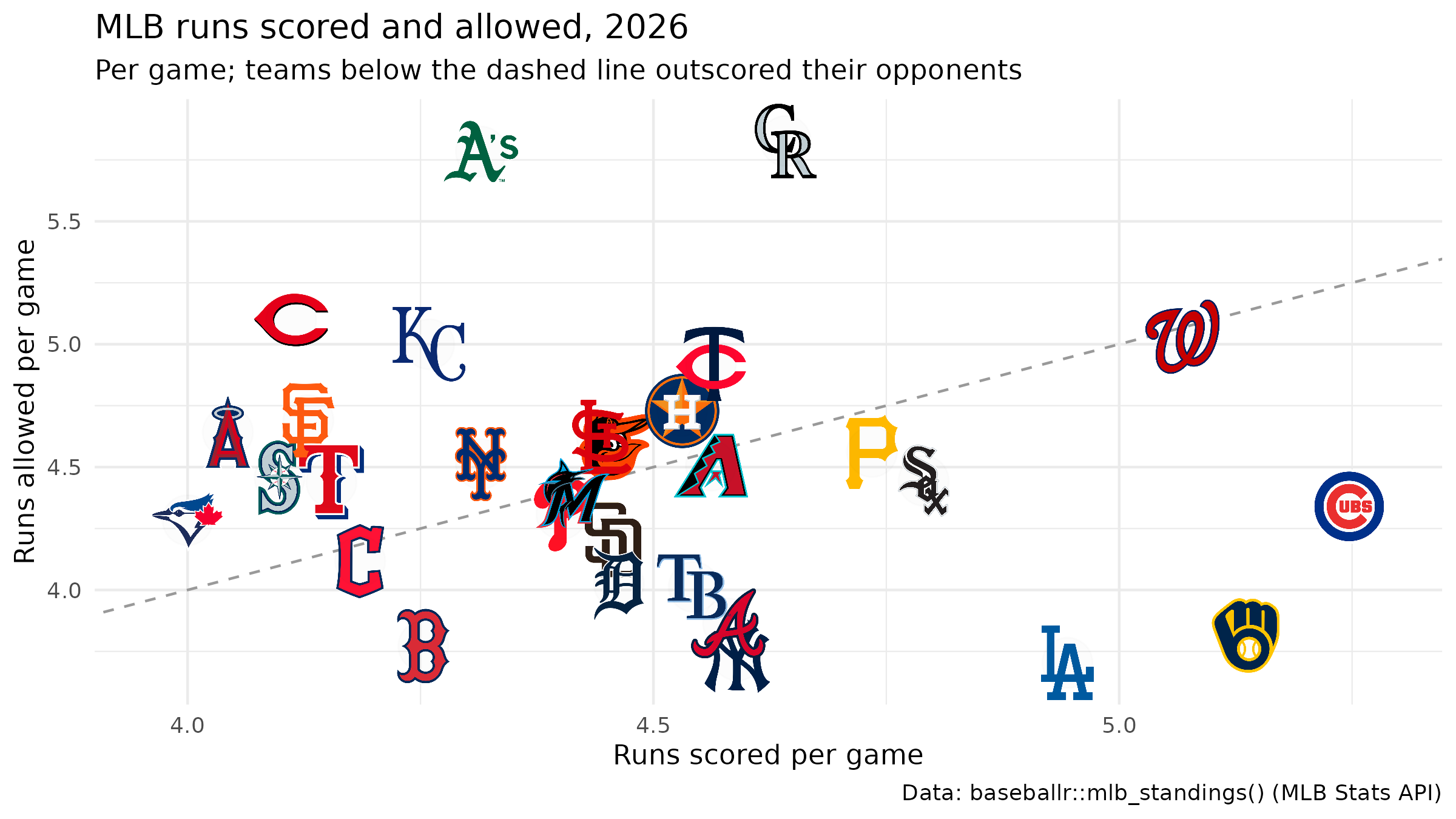
plotly has no ggsave(); render its HTML in a headless
browser with webshot2. That needs Chrome or Chromium on the machine, and
a browser started from a scheduled build can stall, so this chunk is
shown but not run when the site builds:
p_plotly <- plot_ly(
  nhl, x = ~gf, y = ~ga, type = "scatter", mode = "markers", marker = list(opacity = 0)
) |>
  layout(
    title = "NHL goals per game, 2025-26",
    xaxis = list(range = range(nhl$gf) + c(-0.15, 0.15)),
    yaxis = list(range = rev(range(nhl$ga) + c(-0.15, 0.15))),
    images = logo_images(nhl$team, nhl$gf, nhl$ga, "nhl", sizex = 0.12, sizey = 0.12)
  ) |>
  config(staticPlot = TRUE)
htmlwidgets::saveWidget(p_plotly, file.path(out, "nhl.html"), selfcontained = TRUE)
options(chromote.timeout = 60) # a loaded machine can take over chromote's 10-second default to start Chrome
webshot2::webshot(file.path(out, "nhl.html"), file.path(out, "nhl.png"),
  vwidth = 1200, vheight = 675, delay = 2
)
magick::image_info(magick::image_read(file.path(out, "nhl.png")))[c("width", "height")]
delay gives the logos time to load before the
screenshot; raise it on a slow connection.






Related SportsDataverse packages
- sdvplot - the Python plotting package
- sdvplot-js - the JavaScript / TypeScript plotting packages
- cfbfastR - college football
- hoopR - men’s basketball
- wehoop - women’s basketball
- baseballr - baseball
- fastRhockey - hockey
- oddsapiR - betting odds
- sportyR - playing surfaces
- sportsdataverse-py - the Python package
- sportsdataverse-R - the R meta-package