Interactive MLB Run Differential
Saiem Gilani


Source: vignettes/recipe-mlb-run-differential-interactive.Rmd
recipe-mlb-run-differential-interactive.RmdOn this page
The brief: the end-of-season post already has the MLB Run Differential graphic. The web version should let a reader point at any team and read its record, runs scored, runs allowed and differential, then see whether that team won as many games as its runs say it should have. The game results come from the MLB Stats API schedule through baseballr, as in the static recipe; ggiraph makes the ggplot interactive and keeps every sdvplotR layer, logos included.
library(sdvplotR)
library(ggplot2)
library(dplyr, warn.conflicts = FALSE)
library(ggiraph)
library(patchwork)

season <- 2026
1. Get the data
The same three calls as the static recipe: the regular-season schedule (one row per game, with the final score), the clubs (for abbreviations) and the standings (for a check).
schedule <- baseballr::mlb_schedule(season = season, level_ids = "1") |>
  filter(game_type == "R") |>
  select(
    game_pk, official_date, status_coded_game_state,
    teams_home_team_id, teams_away_team_id, teams_home_score, teams_away_score
  )
teams <- baseballr::mlb_teams(season = season, sport_ids = 1) |>
  select(team_id, team_abbreviation)
official <- baseballr::mlb_standings(season = season, league_id = "103,104") |>
  transmute(team_id = team_records_team_id, run_differential = team_records_run_differential)
The output below uses a snapshot of these calls taken on October 05, 2026 (baseballr 2.0.0), because the MLB Stats API is not called when this site is built.
Only final games count, once each (a suspended game is listed on the day it was scheduled and the day it was finished). Stacking the home and away sides gives one row per team per game; this time each row keeps the runs scored and allowed as well as the margin, so the totals carry wins, losses and both run columns. They must still match the official standings.
finals <- schedule |>
  filter(status_coded_game_state == "F") |> # final, including games completed early
  arrange(desc(official_date)) |>
  distinct(game_pk, .keep_all = TRUE)

games <- bind_rows(
  transmute(finals, game_pk, team_id = teams_home_team_id, rs = teams_home_score, ra = teams_away_score),
  transmute(finals, game_pk, team_id = teams_away_team_id, rs = teams_away_score, ra = teams_home_score)
)

stopifnot(identical(class(games$team_id), class(teams$team_id)))
clubs <- sdv_teams("mlb")
totals <- games |>
  group_by(team_id) |>
  summarise(games = n(), wins = sum(rs > ra), losses = sum(rs < ra), rs = sum(rs), ra = sum(ra)) |>
  mutate(diff = rs - ra, win_pct = wins / games) |>
  inner_join(teams, by = "team_id") |>
  rename(team = team_abbreviation) |>
  mutate(name = clubs$name[match(sdv_resolve(team, league = "mlb"), clubs$team_id)]) |>
  arrange(diff, team) # tied totals need a second key to keep one order every run

check <- inner_join(totals, official, by = "team_id")
stopifnot(nrow(check) == 30, all(check$diff == as.integer(check$run_differential)))
tail(select(totals, team, wins, losses, rs, ra, diff), 5)
#> # A tibble: 5 × 6
#>   team   wins losses    rs    ra  diff
#>   <chr> <int>  <int> <int> <int> <int>
#> 1 ATL      94     68   742   626   116
#> 2 NYY      93     68   739   601   138
#> 3 CHC      89     73   850   703   147
#> 4 LAD     100     62   801   600   201
#> 5 MIL     103     59   832   618   214
Thirty rows, one per team: that is all the chart embeds.
2. Bars with a hover card
geom_col_interactive() is geom_col() with
ggiraph’s tooltip and data_id aesthetics. The
tooltip is HTML: the team, its record, runs scored and allowed, and the
differential. The chart is a function of the table so the later steps
can redraw it; logos = FALSE keeps the team abbreviations
on the axis for now.
totals <- mutate(
  totals,
  team = factor(team, levels = team), # bar order: worst at the bottom, best at the top
  tip = sprintf(
    "<b>%s</b><br>%d-%d (%.3f)<br>%d runs scored, %d allowed<br>Run differential %+d",
    name, wins, losses, win_pct, rs, ra, diff
  )
)

bar_chart <- function(d, logos = TRUE) {
  p <- ggplot(d, aes(diff, team)) +
    geom_col_interactive(aes(fill = team, tooltip = tip, data_id = team), width = 0.72) +
    geom_vline(xintercept = 0, color = "grey20", linewidth = 0.4) +
    scale_fill_sdv(league = "mlb", guide = "none") +
    labs(x = "Run differential", y = NULL) +
    theme_minimal(base_size = 9) +
    theme(panel.grid.major.y = element_blank(), panel.grid.minor = element_blank())
  if (logos) p <- p + scale_y_sdv(league = "mlb", size = 13) + theme_y_sdv()
  p
}

girafe(ggobj = bar_chart(totals, logos = FALSE), width_svg = 6, height_svg = 6.5)
3. Logos on the axis, highlight on hover and click
scale_y_sdv() and theme_y_sdv() swap the
abbreviations for logos; the SVG embeds them, so they show in the widget
too. Each is a small copy sized for its label, so the thirty of them add
about 100 KB.
By default ggiraph only tints the hovered bar.
opts_hover_inv() fades every other bar, so the hovered team
stands out from the other 29, and opts_selection() keeps a
bar highlighted after a click, for reading two teams side by side. Click
the bar again to release it.
bar_opts <- list(
  opts_tooltip(css = "background:white;color:black;padding:6px;border-radius:6px;font-size:12px;"),
  opts_hover(css = "stroke:black;stroke-width:1.5px;"),
  opts_hover_inv(css = "opacity:0.25;"),
  opts_selection(type = "multiple", css = "stroke:black;stroke-width:2px;")
)

girafe(ggobj = bar_chart(totals), width_svg = 6, height_svg = 6.5, options = bar_opts)
4. Did the runs turn into wins?
Run differential predicts winning percentage. Bill James’s Pythagorean expectation puts a team’s expected winning percentage at RS^1.83 / (RS^1.83 + RA^1.83). Holding the season’s league average of runs per game fixed, that gives a curve of expected winning percentage against run differential. Teams above the curve won more than their runs say, teams below it fewer.
geom_sdv_logos_interactive() is
geom_sdv_logos() with a hover target over each logo, so the
logo takes the same tooltip and data_id as the
bars. Put the two charts side by side with patchwork and give them to
one girafe(): the shared data_id links them,
so hovering a bar lights up that team’s logo in the scatter, and
hovering a logo lights up its bar. The scatter already carries the
logos, so the bars go back to abbreviations here
(bar_logos = FALSE) and the page embeds each logo once
instead of twice.
pyth <- function(rs, ra, k = 1.83) rs^k / (rs^k + ra^k)
per_game <- sum(totals$rs) / sum(totals$games) # league runs per team per game
avg_games <- mean(totals$games)
curve <- tibble(diff = seq(min(totals$diff), max(totals$diff), length.out = 100)) |>
  mutate(win_pct = pyth(per_game + diff / avg_games / 2, per_game - diff / avg_games / 2))

totals <- mutate(
  totals,
  pyth_wins = games * pyth(rs, ra),
  tip = sprintf(
    "%s<br>Pythagorean record %.0f-%.0f (%+.0f wins)",
    tip, pyth_wins, games - pyth_wins, wins - pyth_wins
  )
)

scatter <- ggplot(totals, aes(diff, win_pct)) +
  geom_hline(yintercept = 0.5, color = "grey70", linewidth = 0.3) +
  geom_line(data = curve, color = "grey45", linetype = "dashed") +
  geom_sdv_logos_interactive(
    aes(team = team, tooltip = tip, data_id = team),
    league = "mlb", width = 0.055
  ) +
  scale_y_continuous(labels = function(x) sub("^0", "", sprintf("%.3f", x))) +
  labs(x = "Run differential", y = "Winning percentage") +
  theme_minimal(base_size = 9) +
  theme(panel.grid.minor = element_blank())

linked <- function(bar_logos = TRUE) {
  bar_chart(totals, logos = bar_logos) + scatter +
    plot_layout(widths = c(1, 1.3)) +
    plot_annotation(
      title = sprintf("MLB run differential and winning percentage, %d", season),
      subtitle = "Dashed curve: the Pythagorean expectation. Above it, a team won more games than its runs predict.",
      caption = "Data: MLB Stats API via baseballr  |  Chart: sdvplotR",
      theme = theme(
        plot.title = element_text(face = "bold", size = 13),
        plot.subtitle = element_text(color = "grey40", size = 9),
        plot.caption = element_text(color = "grey45", size = 7.5),
        plot.background = element_rect(fill = "white", color = NA)
      )
    )
}

mlb_widget <- girafe(ggobj = linked(bar_logos = FALSE), width_svg = 9, height_svg = 6, options = bar_opts)
mlb_widget
bar_chart() redraws from the updated table, so the bars’
tooltips carry the Pythagorean record too.
5. Share it
htmlwidgets::saveWidget() writes the widget to one HTML
file. selfcontained = TRUE inlines ggiraph’s JavaScript,
and the logos travel inside the SVG, so the file opens anywhere with no
folder beside it and no network (it needs pandoc, which ships with
RStudio).
out_dir <- tempfile("sdvplotR-recipe-") # where the file goes; use your own folder
dir.create(out_dir)
html <- file.path(out_dir, "mlb_run_differential.html")
htmlwidgets::saveWidget(mlb_widget, html, selfcontained = TRUE)
round(file.size(html) / 1024) # kilobytes
#> [1] 8914
6. A static version
Without girafe() the same patchwork is an ordinary
ggplot: the interactive layers draw as plain bars and logos, and the
hover targets stay invisible. A PNG has no page weight to watch, so the
bars get their axis logos back. Save it with ggsave() for a
social post, as in the MLB
Run Differential recipe.
linked()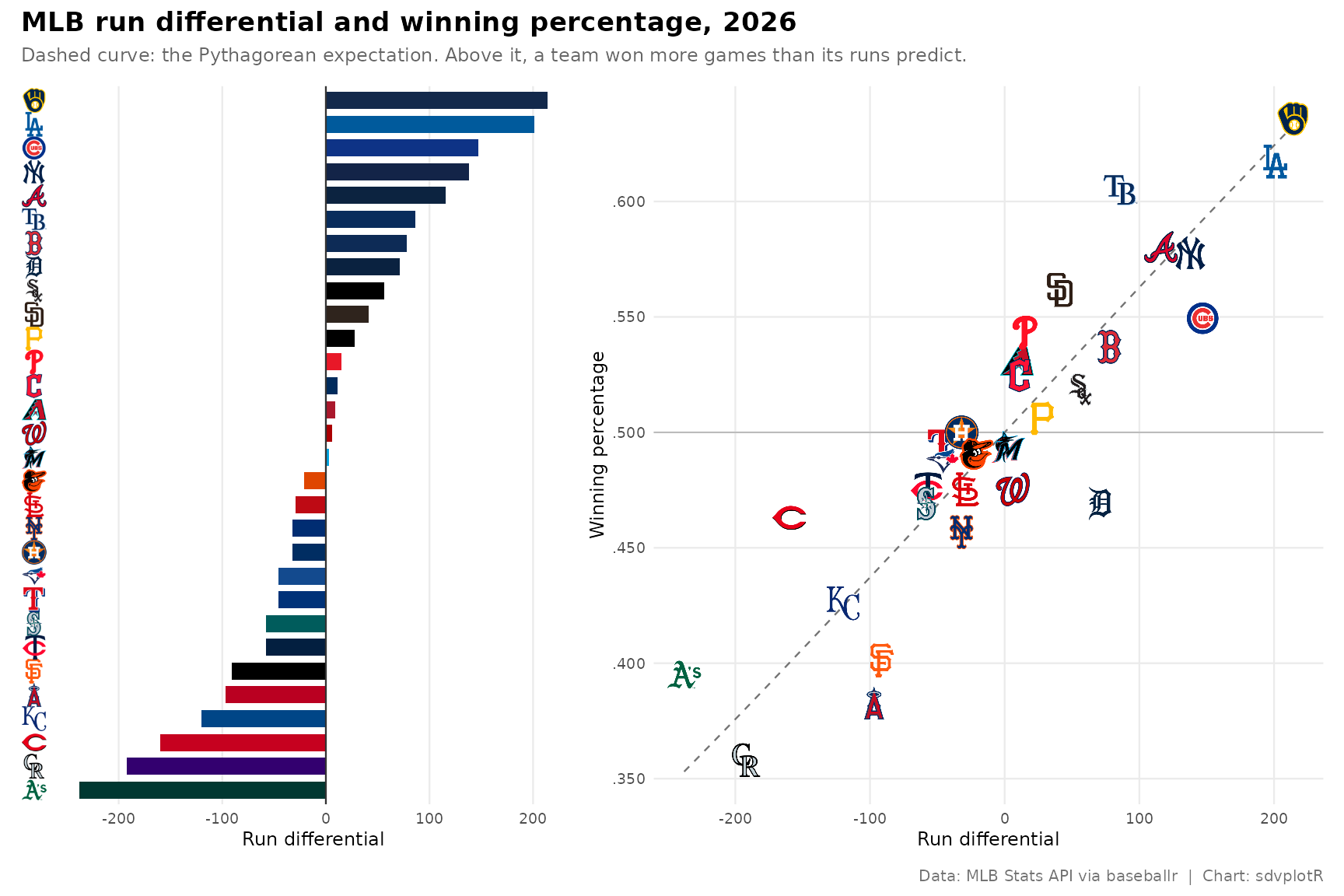
Related
- MLB Run Differential: the static recipe this page extends, with the season line and the 1600 px blog export.
- Interactive charts: ggiraph, plotly, leaflet and reactable recipes.
- Reference:
geom_sdv_logos_interactive(),scale_y_sdv(),theme_y_sdv(),scale_fill_sdv(),sdv_teams(),sdv_resolve().






Related SportsDataverse packages
- sdvplot - the Python plotting package
- sdvplot-js - the JavaScript / TypeScript plotting packages
- cfbfastR - college football
- hoopR - men’s basketball
- wehoop - women’s basketball
- baseballr - baseball
- fastRhockey - hockey
- oddsapiR - betting odds
- sportyR - playing surfaces
- sportsdataverse-py - the Python package
- sportsdataverse-R - the R meta-package