College Hoops Tiers
Saiem Gilani


Source: vignettes/recipe-college-hoops-tiers.Rmd
recipe-college-hoops-tiers.RmdOn this page
The brief: a college basketball account wants an
end-of-season Big Ten tier list, the kind fans argue about, but backed
by a power rating instead of vibes, as a 1200 x 675 post plus a 1080 x
1080 cut. The rating is the SportsDataverse adjusted efficiency margin
for men’s college basketball through hoopR, and
sdv_team_tiers(), sdvplotR’s Tiermaker, draws the list.
library(sdvplotR)
library(ggplot2)
library(dplyr, warn.conflicts = FALSE)

season <- 2026 # the 2025-26 season, named by the year it ends
conference <- "Big Ten"
out_dir <- tempfile("sdvplotR-recipe-") # where the exports go; use your own folder
dir.create(out_dir)
1. Get the data
One row per team: adjusted offense, defense and their margin (points
per 100 possessions better than an average Division I team, adjusted for
opponents). The ratings carry ESPN team ids as text, and so does
sdv_teams(), which adds each team’s conference and
abbreviation. The two types are checked before the join.
ratings <- hoopR::load_mbb_ratings(season)
teams <- sdv_teams("mbb") |>
  transmute(team_id, team_abbr = abbr, team_short_name = short_name, conference = sub(" Conference$", "", conference))
stopifnot(identical(class(ratings$team_id), class(teams$team_id)))

league <- ratings |>
  inner_join(teams, by = "team_id") |>
  filter(conference == !!conference) |>
  arrange(desc(adj_em), team_abbr) |>
  select(team_abbr, team_short_name, rank, adj_em)
league
#> # A tibble: 18 × 4
#>    team_abbr team_short_name  rank adj_em
#>    <chr>     <chr>           <int>  <dbl>
#>  1 MICH      Michigan            1  47.4
#>  2 ILL       Illinois            4  40.8
#>  3 PUR       Purdue              8  37.8
#>  4 MSU       Michigan St        11  35.2
#>  5 NEB       Nebraska           17  32.3
#>  6 IOWA      Iowa               23  29.7
#>  7 WIS       Wisconsin          24  28.5
#>  8 OSU       Ohio State         26  28.0
#>  9 UCLA      UCLA               30  26.5
#> 10 IU        Indiana            39  24.2
#> 11 WASH      Washington         50  21.0
#> 12 NU        Northwestern       59  18.5
#> 13 USC       USC                71  15.5
#> 14 MINN      Minnesota          78  15.0
#> 15 ORE       Oregon             92  12.3
#> 16 MD        Maryland          121   7.17
#> 17 RUTG      Rutgers           124   6.90
#> 18 PSU       Penn State        130   6.37
2. The first draft
Five tiers of equal size, straight into
sdv_team_tiers().
draft <- league |>
  mutate(team = team_abbr, tier_no = ((row_number() - 1) * 5) %/% n() + 1) # five tiers of (nearly) equal size
sdv_team_tiers(draft, league = "mbb")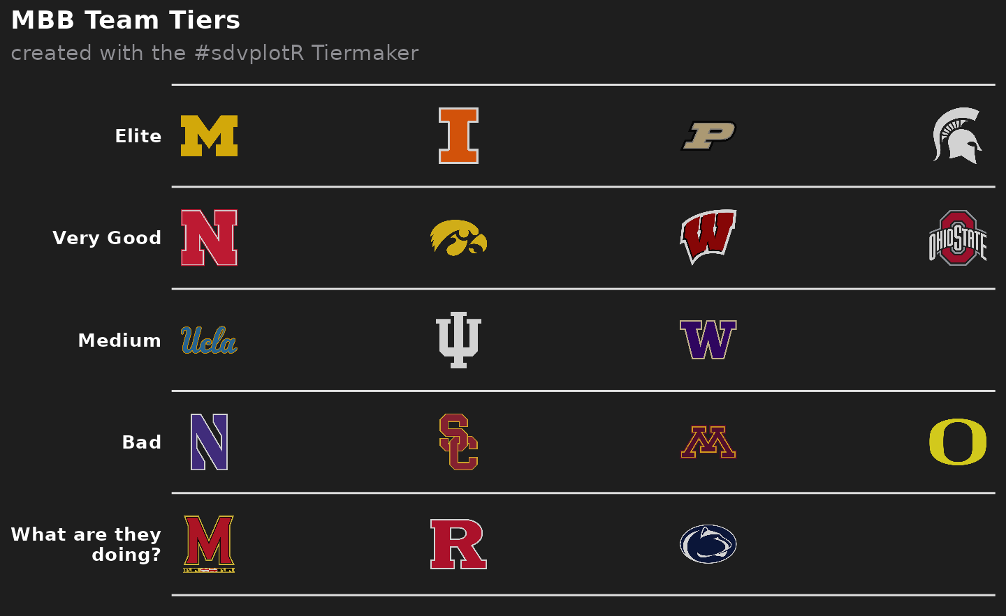
It looks like a tier list, but the tiers are wrong. Equal-sized groups put the best team in the conference in the same tier as a team more than ten points worse per 100 possessions, and split neighbors less than two points apart. The default labels (“Elite” … “What are they doing?”) are jokes, not information.
3. Let the ratings draw the lines
Tiers should break where the ratings do. Sorting by rating and measuring the gap to the team above makes the widest gaps easy to find; cutting at the four widest gives five tiers whose members are close to each other.
league <- league |>
  mutate(gap = lag(adj_em) - adj_em)
cut <- sort(league$gap, decreasing = TRUE)[4] # the fourth-widest gap
league <- league |>
  mutate(tier_no = cumsum(coalesce(gap, 0) >= cut) + 1)
league |>
  filter(gap >= cut) |>
  select(team_short_name, adj_em, gap, tier_no)
#> # A tibble: 4 × 4
#>   team_short_name adj_em   gap tier_no
#>   <chr>            <dbl> <dbl>   <dbl>
#> 1 Illinois         40.8   6.57       2
#> 2 Washington       21.0   3.23       3
#> 3 USC              15.5   3.01       4
#> 4 Maryland          7.17  5.09       5
Each row above starts a new tier, and the size of its gap is the size of the step down from the tier before.
4. Labels that say something
Each tier’s label becomes the rating range of its members, so the
list carries its own evidence, and the title states the finding.
tier_rank keeps teams in rating order inside a tier. The
subtitle explains the rating and the rule for the cuts; the caption
names the data.
ranges <- league |>
  group_by(tier_no) |>
  summarise(hi = max(adj_em), lo = min(adj_em)) |>
  mutate(desc = if_else(hi == lo, sprintf("%+.1f", hi), sprintf("%+.1f to %+.1f", hi, lo)))
tier_desc <- setNames(ranges$desc, ranges$tier_no)

top_tier <- filter(league, tier_no == 1)
title <- if (nrow(top_tier) == 1) {
  paste(top_tier$team_short_name, "stood alone in the", conference)
} else {
  paste(nrow(top_tier), "teams made up the", conference, "top tier")
}

tiers <- league |>
  group_by(tier_no) |>
  mutate(tier_rank = row_number()) |>
  ungroup() |>
  select(team = team_abbr, tier_no, tier_rank)

tier_list <- function(width = 0.075, alpha = 0.8, theme = "dark") {
  sdv_team_tiers(
    tiers,
    league = "mbb",
    title = title,
    subtitle = paste0(
      "Tiers by adjusted efficiency margin, ", season - 1, "-", season %% 100,
      ". A new tier starts at each of the four widest gaps."
    ),
    caption = paste(
      "Margin: points per 100 possessions better than an average D-I team.",
      "Data: SportsDataverse ratings via hoopR  |  sdvplotR Tiermaker",
      sep = "\n"
    ),
    tier_desc = tier_desc,
    width = width,
    alpha = alpha,
    theme = theme
  )
}

tier_list()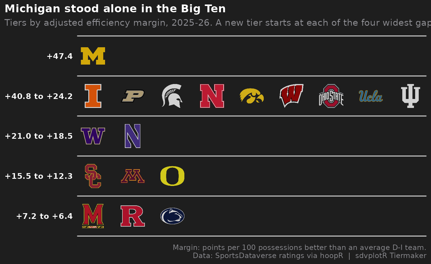
5. Light or dark
On the Tiermaker’s dark background, sdv_team_tiers()
draws each school’s dark-background logo (its default
variant = "auto"), so Iowa’s hawk is gold, Michigan State’s
Spartan white and Penn State’s lion outlined instead of fading into the
background. A light background suits a page or feed that is white
anyway: theme = "light" draws the list on white, with the
text and tier lines turned dark, and each school’s usual logo. The logos
go to full opacity too (alpha = 1); the default 0.8 softens
them against the dark background but washes them out on white. The
exports below use the light one.
tier_list(alpha = 1, theme = "light")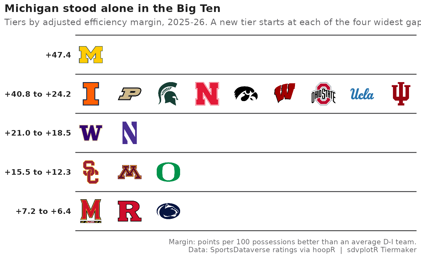
6. Export at social sizes
ggsave() re-lays the same plot at each export size.
width is a share of the panel’s width, and the square’s
panel is narrower than the wide cut’s, so the square gets a slightly
larger share to keep the logos the same size. The widest tier holds the
most logos side by side, which is why the wide 1200 x 675 cut is the
better post here.
wide <- file.path(out_dir, "big_ten_tiers_1200x675.png")
square <- file.path(out_dir, "big_ten_tiers_1080x1080.png")
ggsave(wide, tier_list(alpha = 1, theme = "light"), width = 8, height = 4.5, dpi = 150)
ggsave(square, tier_list(width = 0.085, alpha = 1, theme = "light"), width = 7.2, height = 7.2, dpi = 150)
magick::image_info(magick::image_read(c(wide, square)))[c("width", "height")]
#> # A tibble: 2 × 2
#>   width height
#>   <int>  <int>
#> 1  1200    675
#> 2  1080   1080
magick::image_read(wide)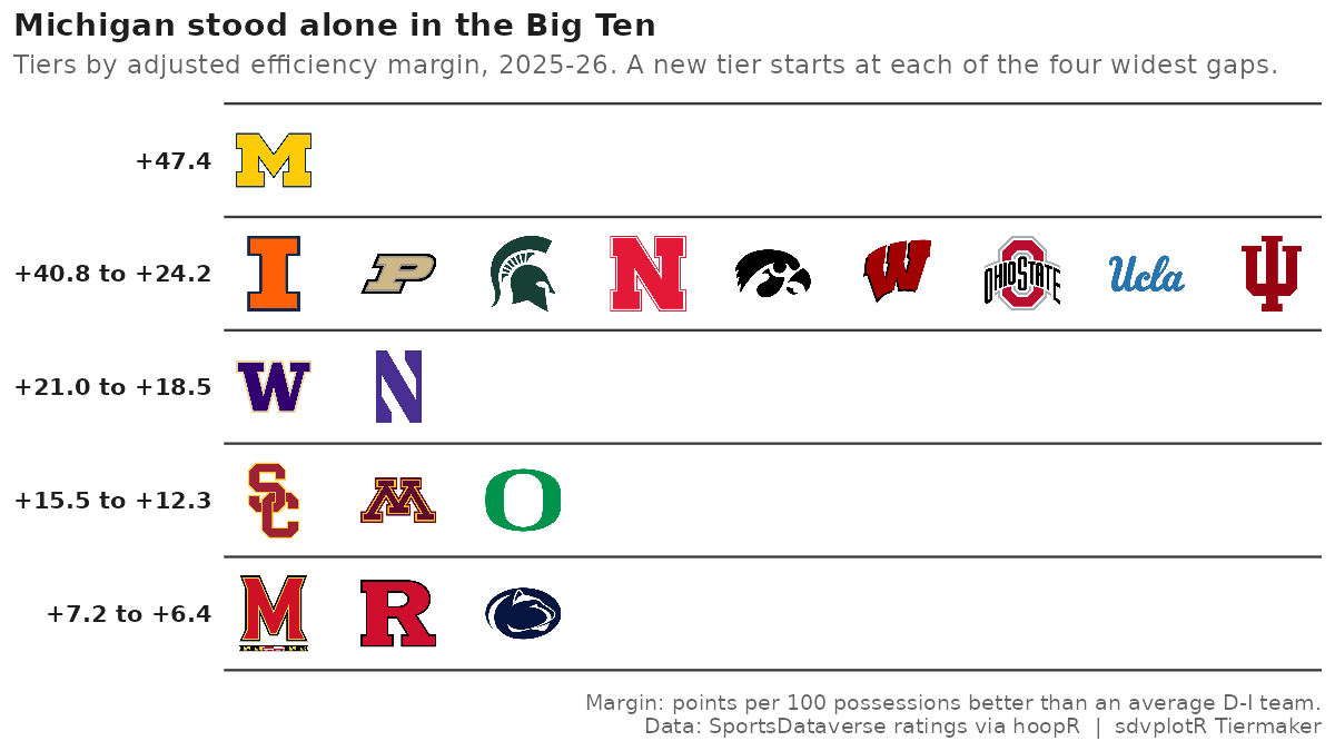
The 1080 x 1080 cut:
magick::image_read(square)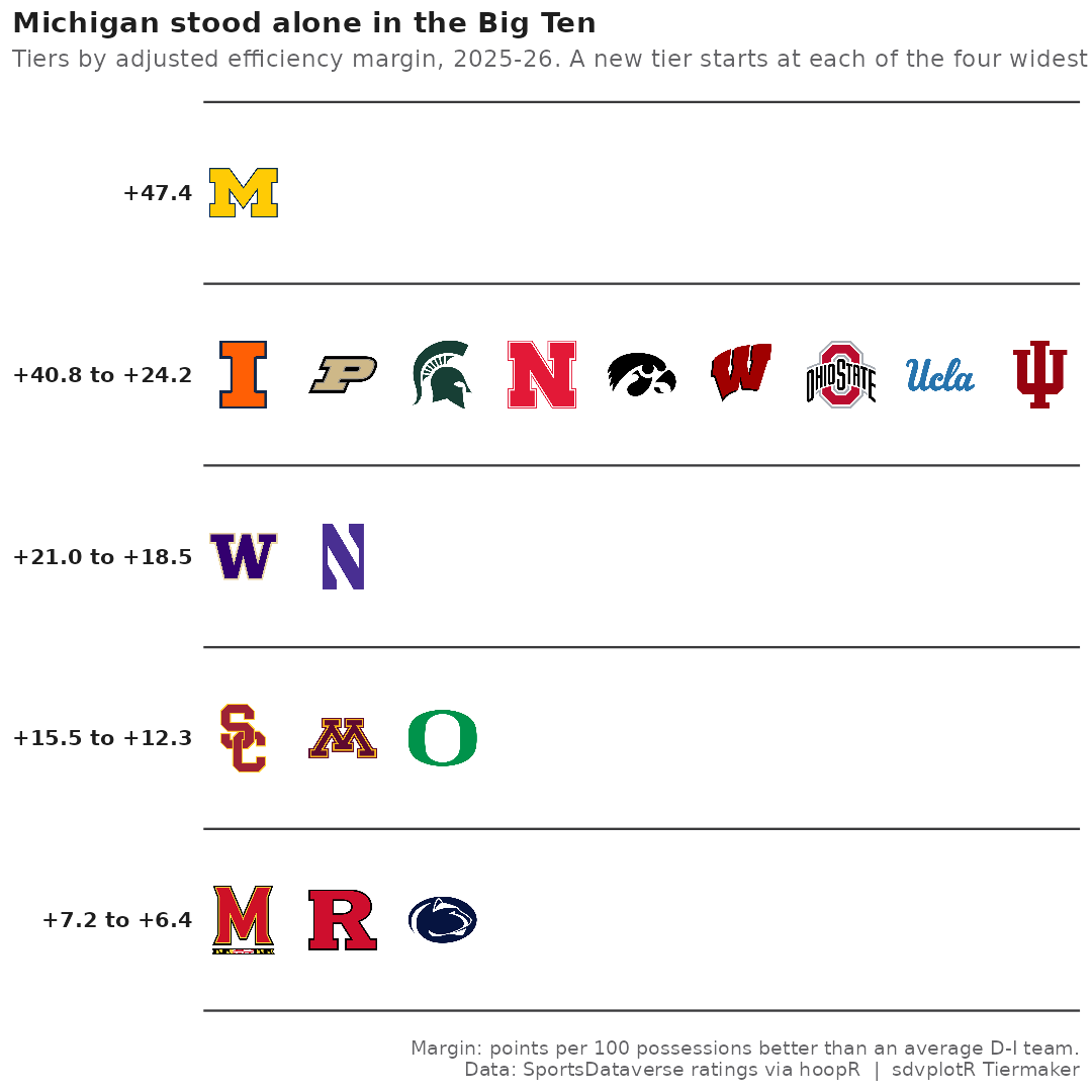






Related SportsDataverse packages
- sdvplot - the Python plotting package
- sdvplot-js - the JavaScript / TypeScript plotting packages
- cfbfastR - college football
- hoopR - men’s basketball
- wehoop - women’s basketball
- baseballr - baseball
- fastRhockey - hockey
- oddsapiR - betting odds
- sportyR - playing surfaces
- sportsdataverse-py - the Python package
- sportsdataverse-R - the R meta-package